"Act so as to keep the mind clear, its judgment trustworthy" - Dickson G. Watts, author of Speculation As A Fine Art And Thoughts On Life. [A brief summary here (link)]

Saturday, March 26, 2011

Real Estate Fun(damentals)

Excellent post over at calculated risk regarding a personal interest of mine: single family home vacancy.

Money quote: "It is easy to see why many housing economists view the current “low” level of housing production as a plus for the overall health of the housing market, even before allowing for the current high number of residential mortgage loans either seriously delinquent or in some stage of foreclosure. It is also easy to understand why competent housing analysts believe that any government policies designed to encourage additional construction of housing units would be “dumber than dishwater,” and that the only government policies designed to encourage increased “AD&C” activity would NOT be acquisition, development, and construction lending, but instead “acquisition, destruction, and or conversion” of existing vacant housing units."

Sunday, March 13, 2011

Trend Analysis (home prices)


It's interesting to me that the Case Shiller Home Price Index (adjusted for inflation) does not exhibit mean reversion characteristics like the stock market (R^2 < 1%). The first chart above shows the index since 1890. Just like last week, the black line is the line of best fit with exponential growth equation y=b*m^x. Once again, the blue line simply represents where the black line would have ended up on the right-hand side if it were calculated each year based solely on data available through that year. The second chart (scatter) just shows there is no statistically notable mean reversion. What I see is a data series that typically does not vary greatly from the trend line; except for the extraordinary bubble of the 2000s. It appears prices have returned to 'normal', but of course prices could potentially 'over correct' and decline ~20% below the trend line as they were for much of the 1920s and 1930s. In case you were wondering, home prices have only exceeded inflation by 0.22% annually since 1890. Separately, look at how wild inflation used to be in the olden days.

Sunday, March 6, 2011

Trend Analysis (part 2)


I wanted to follow up this morning to show how the trend analysis described below is superior to the naive method used by some financial planners whereby they simply calculate the historical annual return for the market and extrapolate that return into the future. What I found is actually a better method than the one described in the post below.

The chart above shows cumulative annual returns since 1880 vs. returns over the subsequent ten years. The line of best fit is y = -8.7698*x+0.1407, where y = annualized returns over the subsequent ten years and x = the annualized returns calculated from 1880 up to the date of calculation. So, since annualized returns since 1880 have equaled 1.7% (inflation adjusted), projected annual returns over the next ten years are -1.0%. So, naively extrapolating 1.7% real returns into the future would be an inferior assumption as it does not account for the mean reverting nature of the market.

The really shocking thing is that this simple regression has R^2=46%, which is incredibly high for a single factor model in relation to a system as random as the stock market.

It's even more shocking when comparing returns over the prior 20 years (rather than since 1880) vs. the subsequent ten years, which is shown in the second chart above. Here the R^2 is 59%. The market close as of 2/25/11 resulted in annualized returns over the prior 20 years of 3.96% (inflation adjusted). Based on this regression with standard error of 3.58%, real annualized returns over the next ten years are projected to be 1.7% with a 50% confidence interval ranging from -0.8% to 4.1%. The 90% confidence interval is -4.2% to 7.6%.

Personally, given the significantly higher R^2 for this regression, I'm inclined to favor this method over the one in the post below that's based on the close/trend metric.

Saturday, March 5, 2011

Trend Analysis


I was viewing a site on my blog roll (http://www.multpl.com/) the other day and thought it might be worthwhile to run some trend analysis on the inflation adjusted monthly S&P 500 data going back to 1880, which you can download there. The charts above reveal some interesting findings.

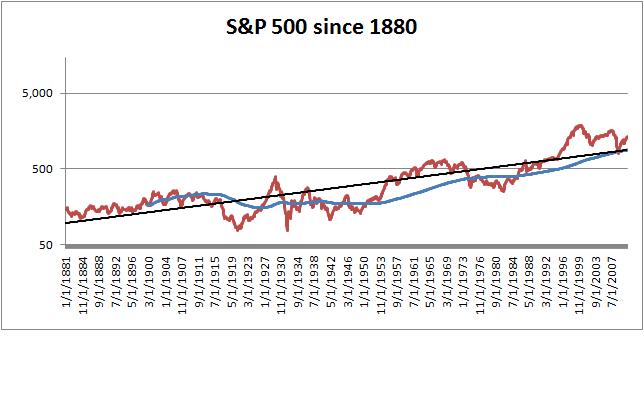
In the first chart, viewed over the past 130 years on a logarithmic scale, the growth of the S&P 500 appears relatively stable around the black trend line. The black trend line is a least-squares regression based on the exponential growth equation y=b*m^x, where x=month, m=coefficient that provides the best fit, and b=constant that provides the best fit. For example, Feb-2011 is the 1,563rd month of the data series, so x=1,563. The best-fit coefficient (m) is 1.001428. The best-fit constant (b) is 95.34. So the result (y) = 95.34*1.001428^1,563 = 886. So 886 is where the black trend line ends up at the right hand side of the chart.

The black trend line of course was regressed using all the data from 1880 to 2011. However, if one was to have traded based on this metric at any point in the past, then of course they would have only had data up until that date. Therefore, the blue line shows where the black trend line would have ended up if calculated each month in the past. For example, in Jan-1900, the black trend line based solely on data from 1880-1900, would have ended up at 165, which is what is shown by the blue line.

Now, if someone had calculated the black trend line in Jan-1900 and derived an end result of 165, they also would have seen the S&P 500 actually was 170 then, so the close(170) / trend(165) equaled 1.03. In other words, at that time, based solely on trend analysis, the market seemed to be at a normal level.

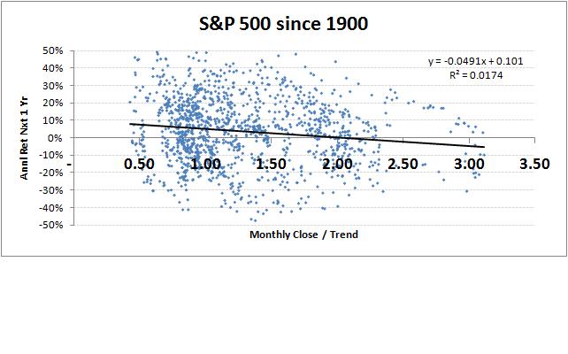
The second chart above shows a scatter comparison of this close/trend metric vs. returns achieved by the S&P 500 over the subsequent year. As you can see, there is a wide dispersion with lots of noise and very little signal. This jives with the stock market being a mostly unpredictable system.

The third chart shows a scatter comparison of the close/trend metric vs. annualized returns over the subsequent five years. There is a bit tighter relationship, but still mostly noise.

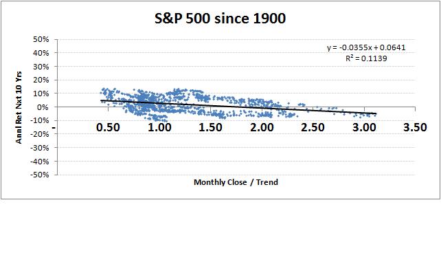
The fourth chart shows annualized returns over the subsequent ten years. Here the relationship is noticeably tighter, but the R^2 is still only 11%.

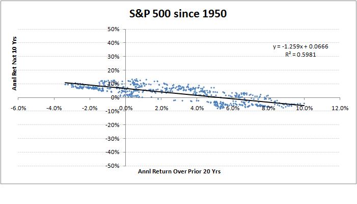
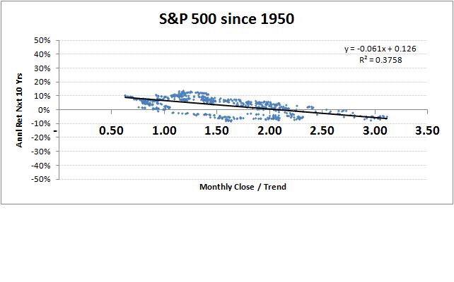
The fifth and last chart is interesting. It shows returns over the subsequent ten years, but the data is just since 1950. So each month the trend line is calculated, it's based on at least 70 years of data (1880-1950) and at the end is based on 120 years of data (1880-2000). Here the relationship is even tighter, with R^2=37%. In some fields, 37% isn't very impressive, but when speaking of a system as random as the stock market, it indicates a relatively strong signal.

So the line of best fit drawn through the last scatter chart has an equation of y = -0.061x+0.126, where x=close/trend. This means, if close/trend = 1.0, then the expected annualized return over the subsequent ten years (y) is 6.5% (inflation adjusted). If close/trend = 2.0, then the expected return would be 0.4%.

Where do we stand now? Well, as of 2/25/11, the S&P 500 closed at 1,320 and the black trend line was at 886, so close/trend was 1.49. Therefore, solely based on this trend analysis, the projected annualized return over the next ten years is 3.5% (inflation adjusted). The standard error of the regression is 4.45%, so the 90% confidence interval is 3.5% +/- 1.65*4.45%, which provides a range of -3.8% to 10.9%. Not very helpful, right? That's the nature of the stock market. All we can say is that when the market is priced substantially above trend, there is a tendency for subsequent returns to be sub par. For grins, the 50% confidence interval for annualized returns over than next ten years is a range of 0.5% to 6.5% (inflation adjusted).

Monday, January 17, 2011

small cap stock beta

Tonight, as I was giving the 'night time' bottle to our 15-month old, I finally figured out something I've been pondering off and on for a while. I wondered, why would a disciple of Modern Portfolio Theory (MPT) expect small cap stocks to provide out-sized returns solely because they are more risky? Actually, I really wondered why they would perceive small caps as more risky?

Having been exposed to arbitrage pricing methods enough to be dangerous, I thought perhaps a collection of small cap stocks should be equivalent to one large cap stock. Or vice versa, one large company is perhaps equivalent to a collection of small companies. But then I remembered the math related to beta calculations and how say 10 small cap stocks, each with betas around 2.0, if put together would create a portfolio that still has a beta of 2.0. The reason is because the beta statistic itself already accounts for the cancelling out of individual stock idiosyncrasies, thereby providing a measure of a stock's underlying covariance with the overall market, net of any 'noise'.

So then I thought, of course that's why MPT followers would expect small caps to provide out-performance (because of greater risk as measured by beta). But I wondered, what is it about being small that makes small companies qualitatively more volatile? It can't be they are too small to have diversified revenue streams, otherwise as implied above, this volatility would go away when many small caps are held together in one portfolio. Rather, it must be something to do with each individual revenue stream (i.e. business) itself being volatile/risky.

But then, why would small companies be predisposed to having volatile revenues? I thinks it's simply by default. In other words, if a company finds a stable revenue stream, they tend not to stay small for very long. Because once you find a stable revenue stream, you no longer have to be quite so nimble to survive, and you can begin to pursue efficiency at the expense of flexibility. You start hiring some MBAs to standardize processes, acquire competitors to transfer best practices, badda bing badda bang, you get BIG.

Thursday, January 13, 2011

new year


Not that I was ever a prolific writer, but now that my one year of blogging has been accomplished (last year's resolution), there will be fewer, more sporadic posts going forward. Perhaps a wrap up, bare bones summary of my investing philosophy as it stands at this point in my life, but otherwise probably just random stuff I think my friends may find useful. Too bad my other resolutions weren't achieved (ahem,exercise,cough).

By the way, as previously mentioned was my intention, I've moved my real brokerage accounts over to folioinvesting.com and will henceforth occasionally share those actual results (e.g. the chart above). So far so good. Once I submitted the account transfer requests online, my retirement funds were moved from my employer (a large bank) over to folio in less than a week. Then, in about 60 seconds, I submitted orders for each of my IRA, Roth IRA, and Taxable Accounts to purchase the 100 stocks in my model portfolio and it was done the next day with $0 commissions (but you have to pay a $290 annual fee to get all you can trade for free). Next step may be to get the wifey to transfer hers and then see how well the platform really works for someone who wants to easily mimic someone else's model portfolio.

new addition to the blog roll

For us Gen X-ers who are somewhat interested in keeping tabs on those Millennials, you could do worse than read this guy. Check it out - http://leighdrogen.com/

Friday, December 24, 2010

bonds vs. bond funds

You may hear sometimes that purchasing a ladder of bonds is better than purchasing a bond fund. A ladder of bonds just means you buy say 5-10 different bonds with various maturity dates. When each bond matures (assuming the issuer doesn't default), you get paid the principal amount of that particular bond. If you plan on spending the payments received upon each bond's maturity then you have a 'non-rolling ladder' bond portfolio. If you plan to reinvest the maturity payment into another bond, then you have a 'rolling ladder' bond portfolio. Since bond funds reinvest the maturity payments received from their maturing bonds, a passively managed bond fund is largely equivalent to a rolling ladder. Except a bond fund provides better diversification and lower transaction costs than you can achieve by constructing your own rolling ladder. But to realize the lower costs of a fund, you have to pick one that is passively managed with a low expense ratio.

Although comparing an individual bond or a non-rolling ladder to a bond fund is like comparing apples to oranges, folks sometimes think a non-rolling ladder provides more certainty and/or less risk because one can ostensibly predict the future payments to be received. However, this perceived attribute isn't real when you account for opportunity costs.

Additional resources:
https://advisors.vanguard.com/iwe/pdf/ICRTBF.pdf